In order to make the current Joii brand design more suitable for a 21st Century app, it needed some tweaks. Get a good context of the before so you can better appreciate the evolution, click here to view the old Joii brand! 😱
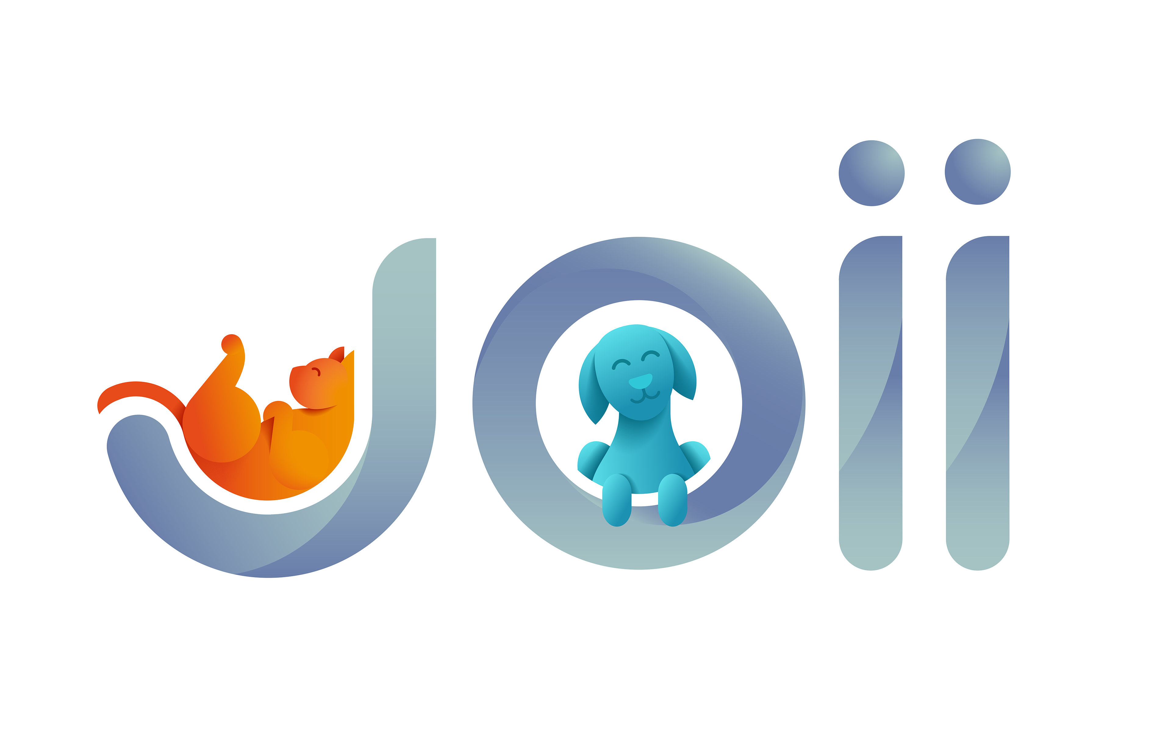


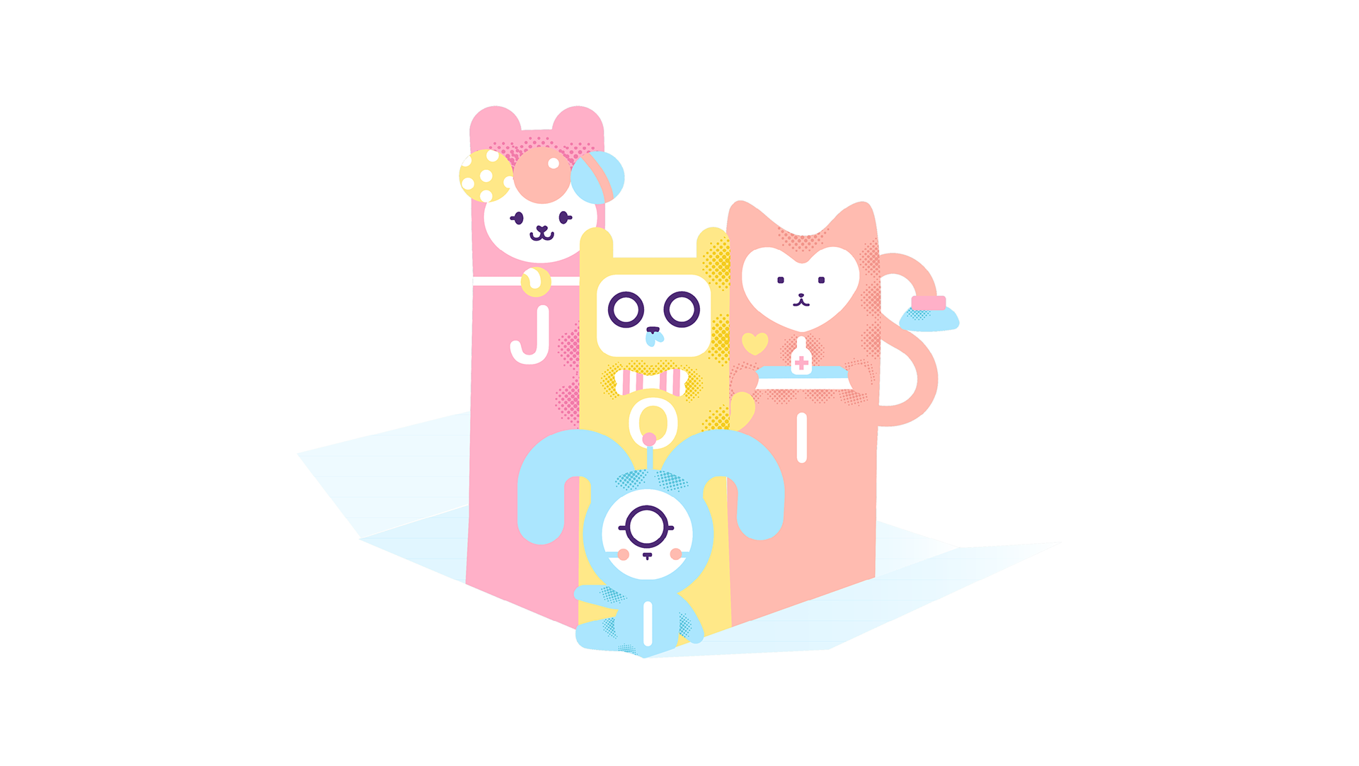
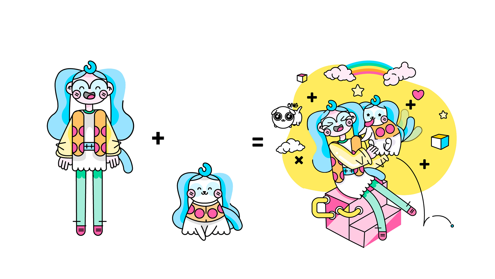
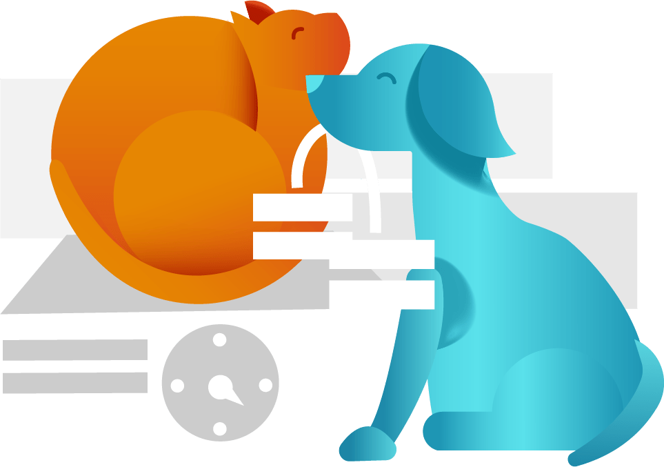
There were originally ten different variations of the logo, I simplified this down to two, a full colour version and a flat white version. A key component from the previous design was that the blue represented the dog mascot and orange represented the cat. This was kept and scaled to simplify the colour palette removing other colours that clashed and adding more complimentary colours that gave us more flexibility when designing assets.
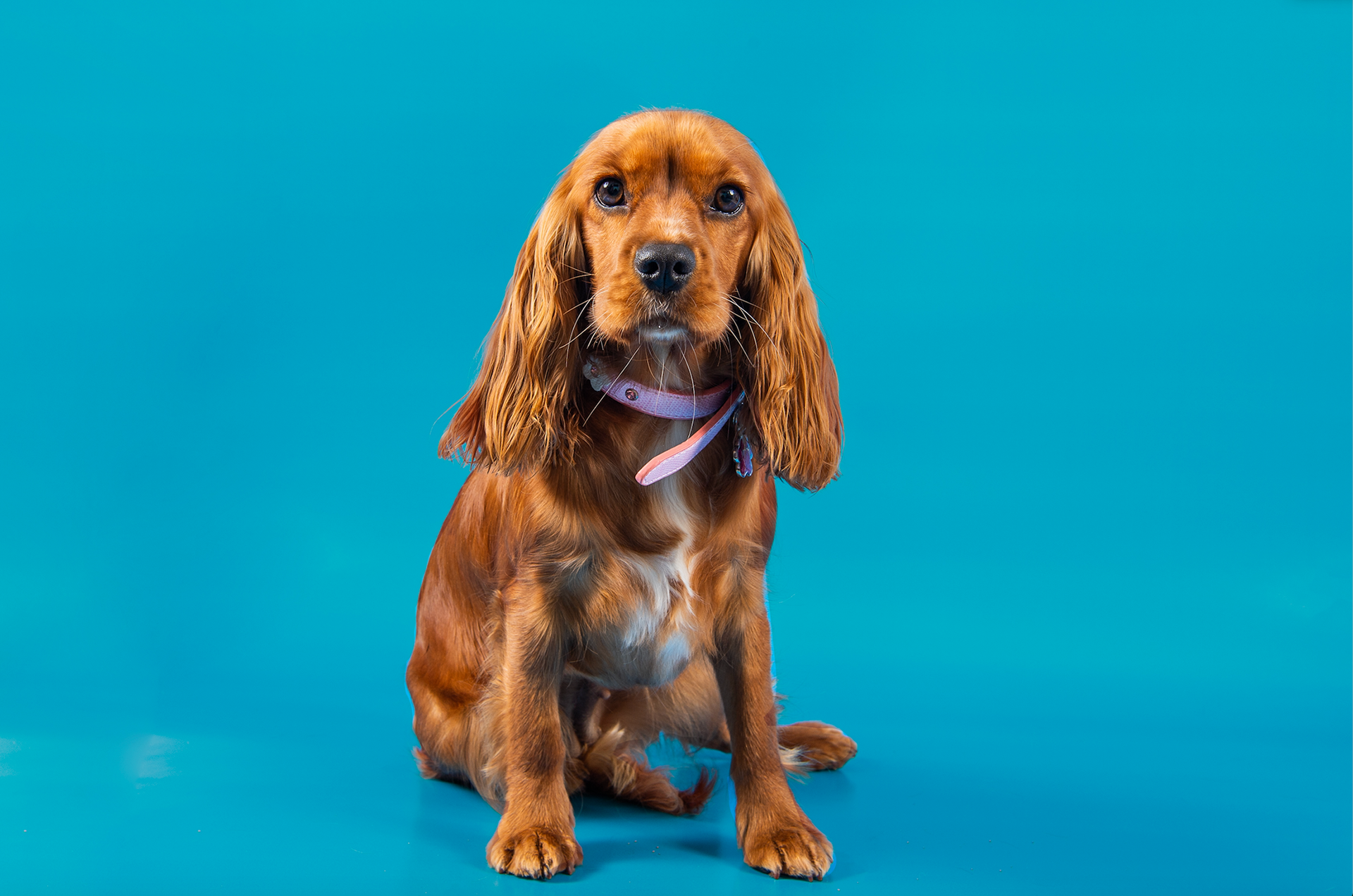
Sky: original inspiration for dog mascot design.
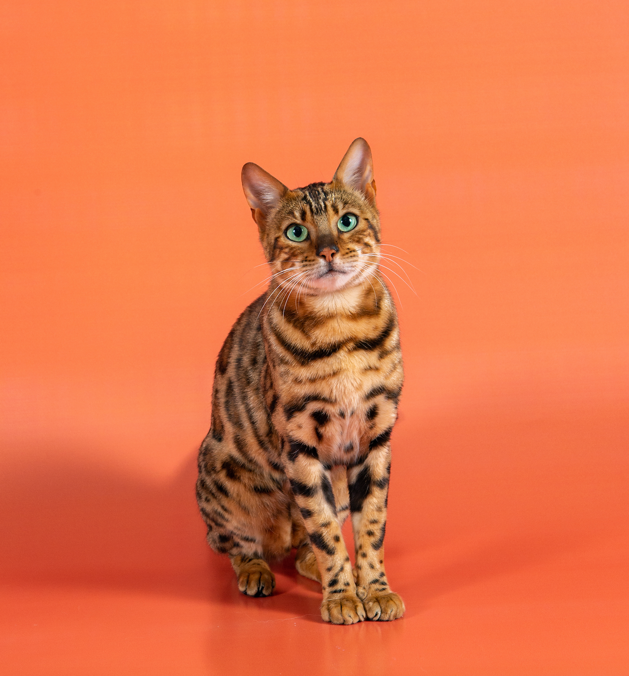
Sienna: original inspiration for cat mascot design.
Design thinking scaled: Designated cat and dog areas with the assigned mascot colours for consistency.

Sea Blue #009cb8

Orange #eb6b0d

Teal #4ab8b9

Mustard #ffa41b

Dark #575757

Light #f6f6f6
Being a brand design for an app, it was important that the UX/UI was prioritised, this meant that simplicity was key. I started by flattening the design and reducing the colour palette significantly using the colours in the logo as an anchor.
Creating a colour palette with some cohesion using colour theory was also important so the brand design was scalable to other assets and mediums, allow for beautiful design work.
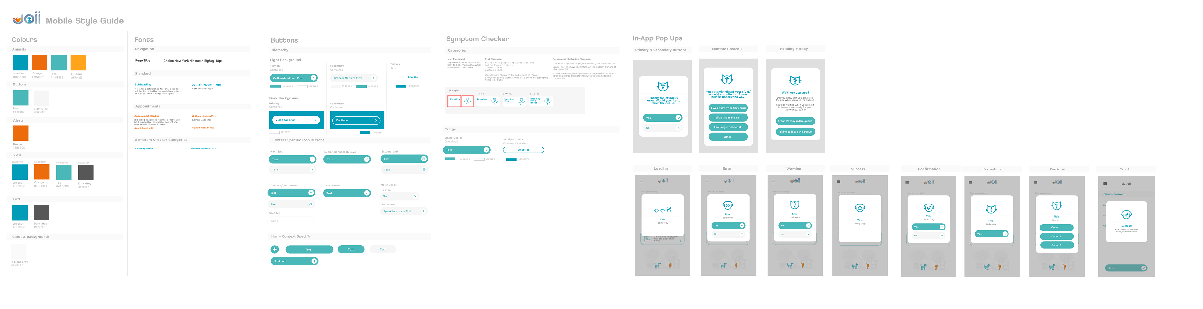
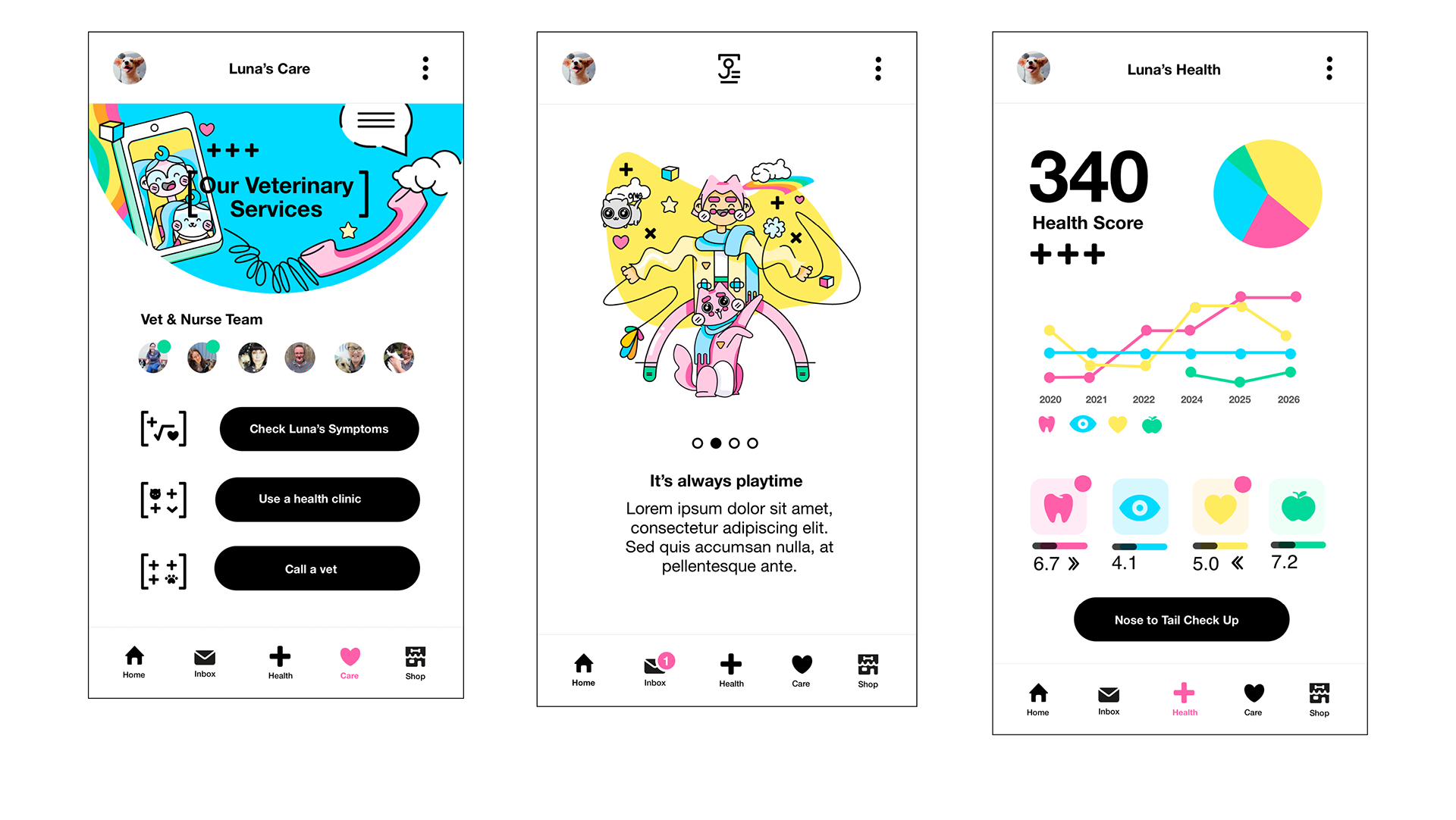
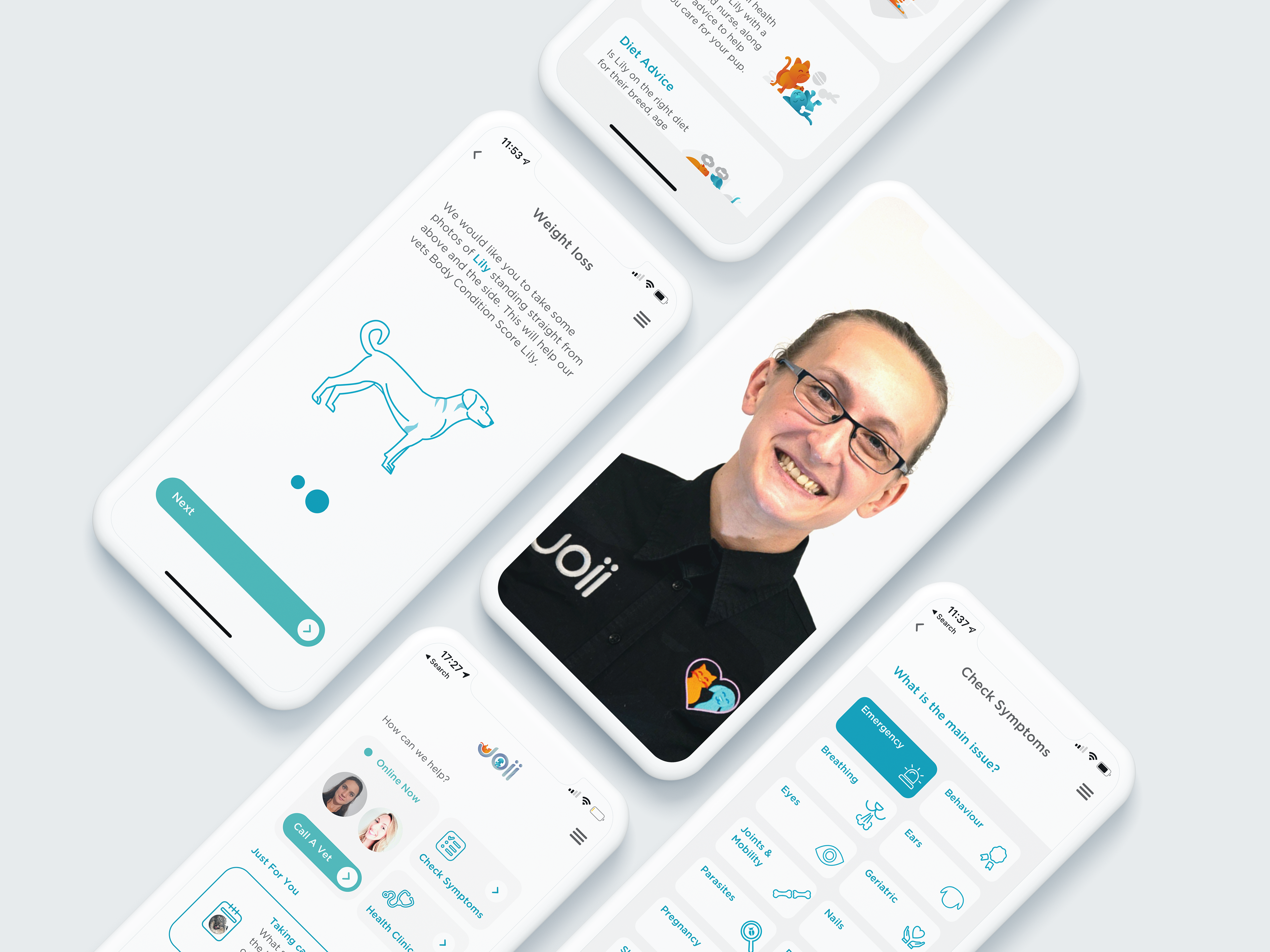
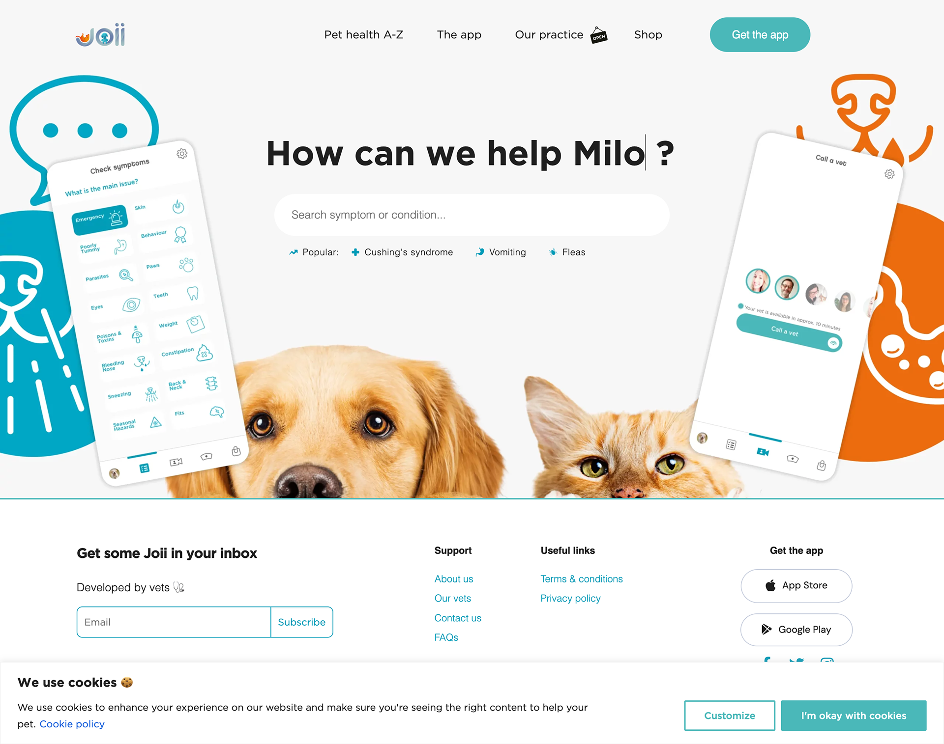
Joii App Design System
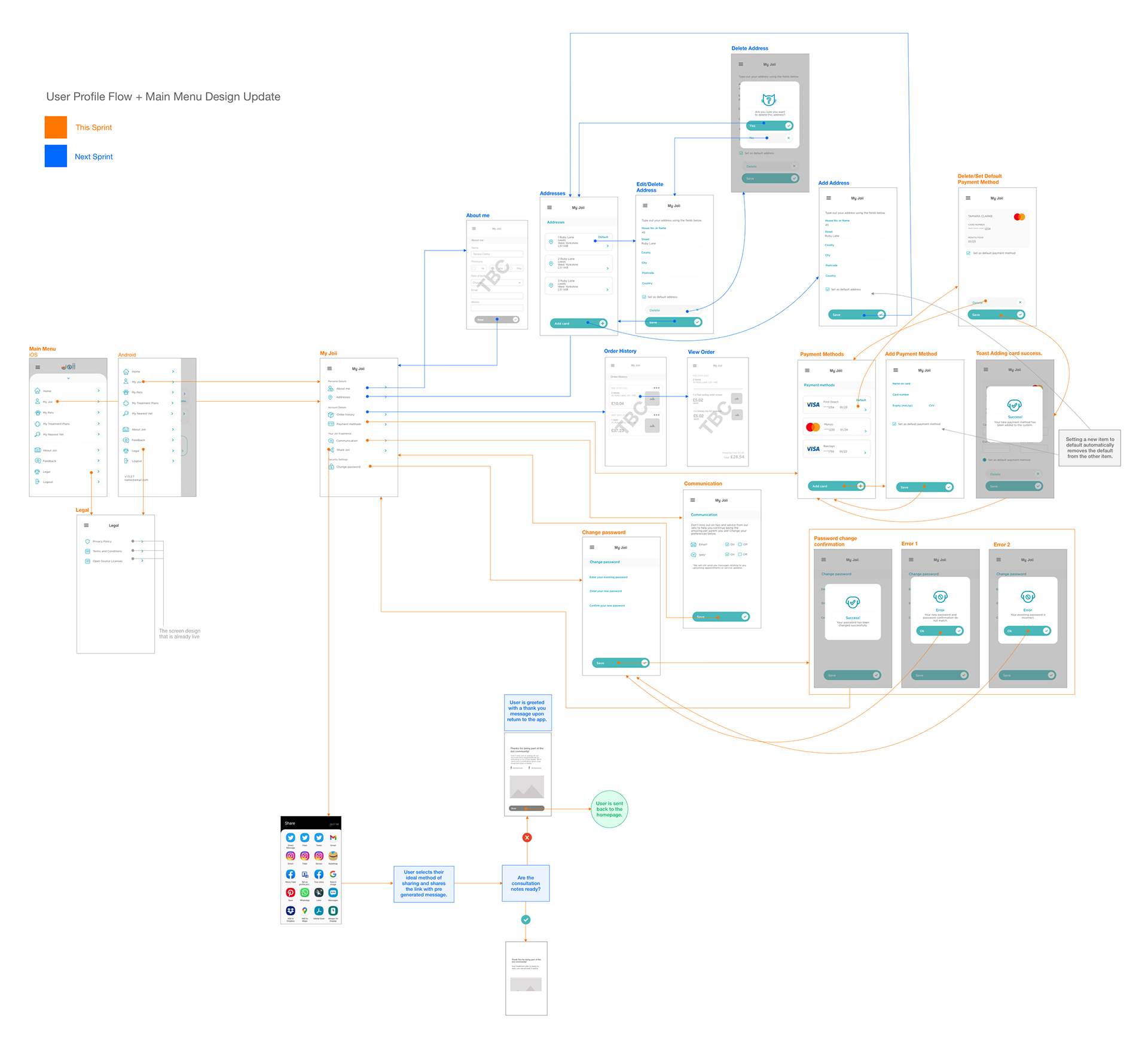
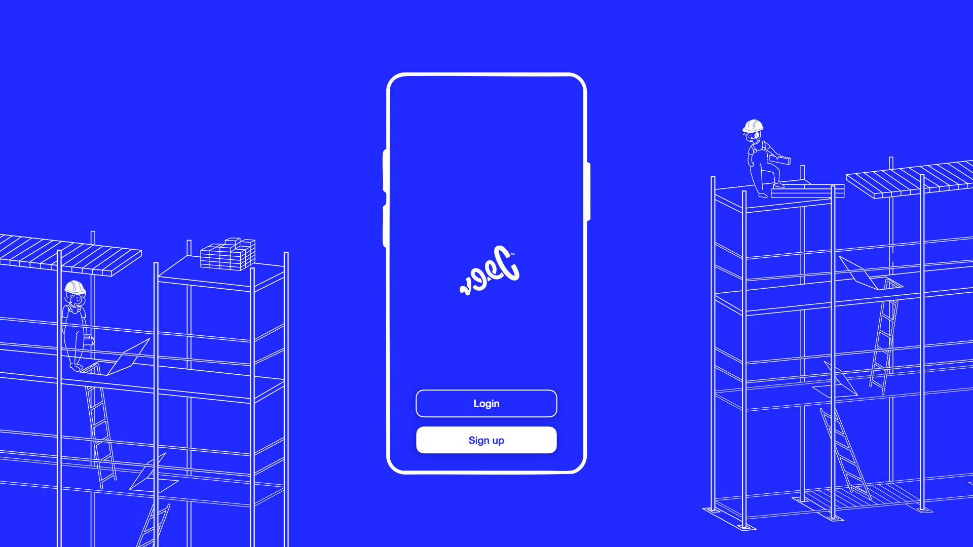
My standard Joii App UX flow
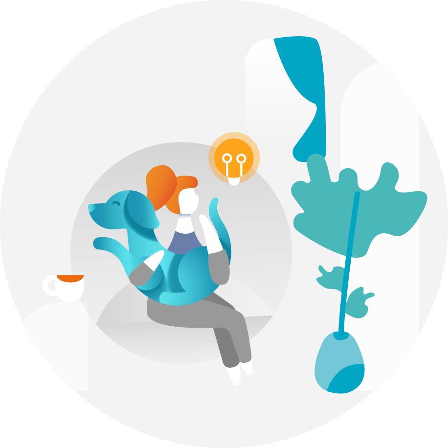
Joii App UX Illustrations
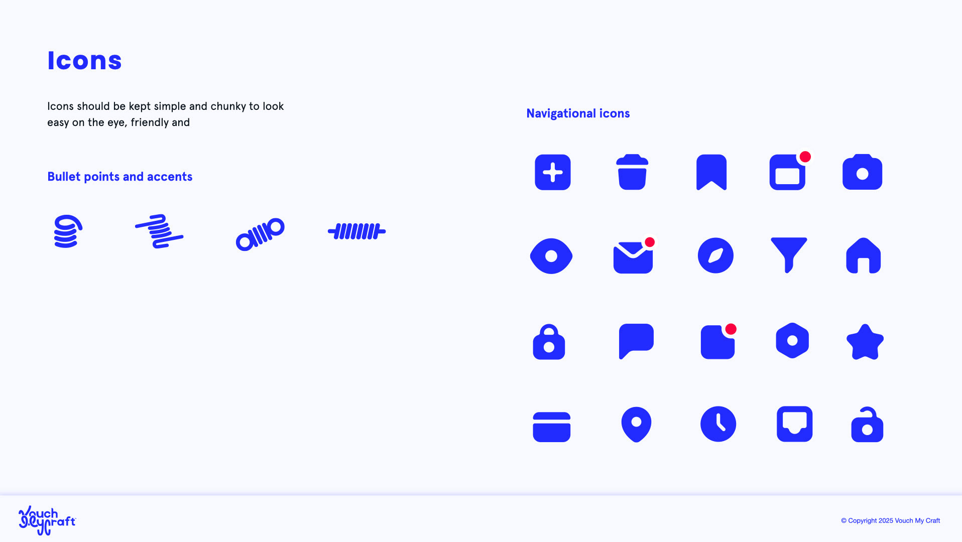
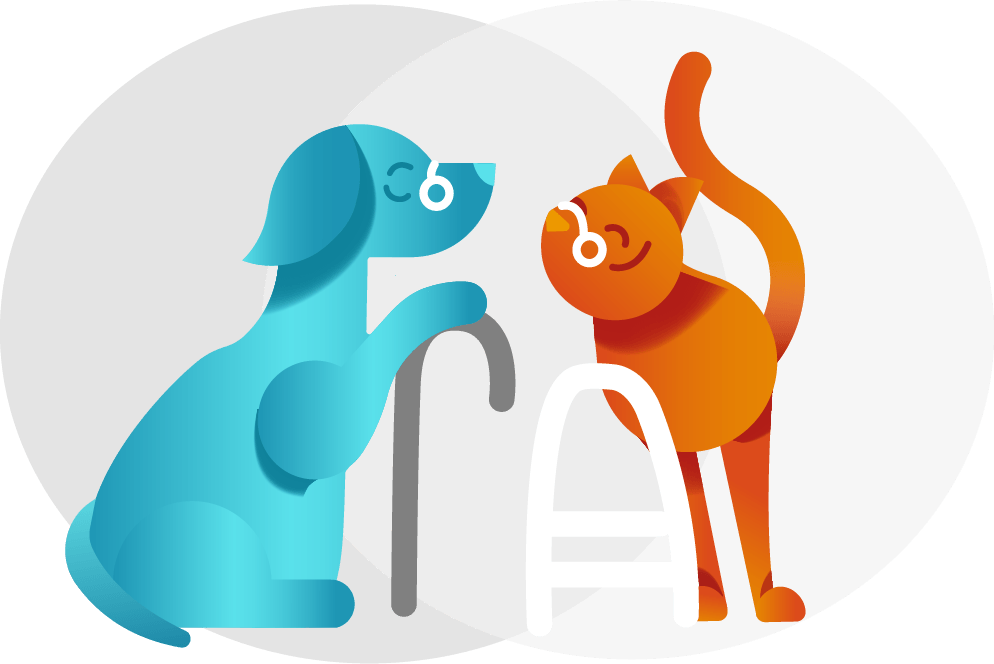
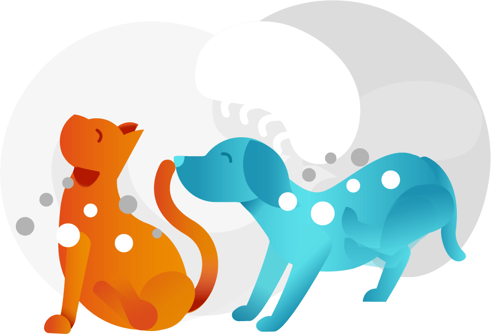
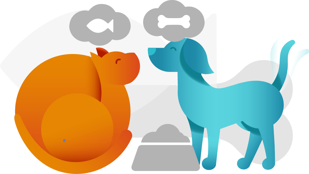
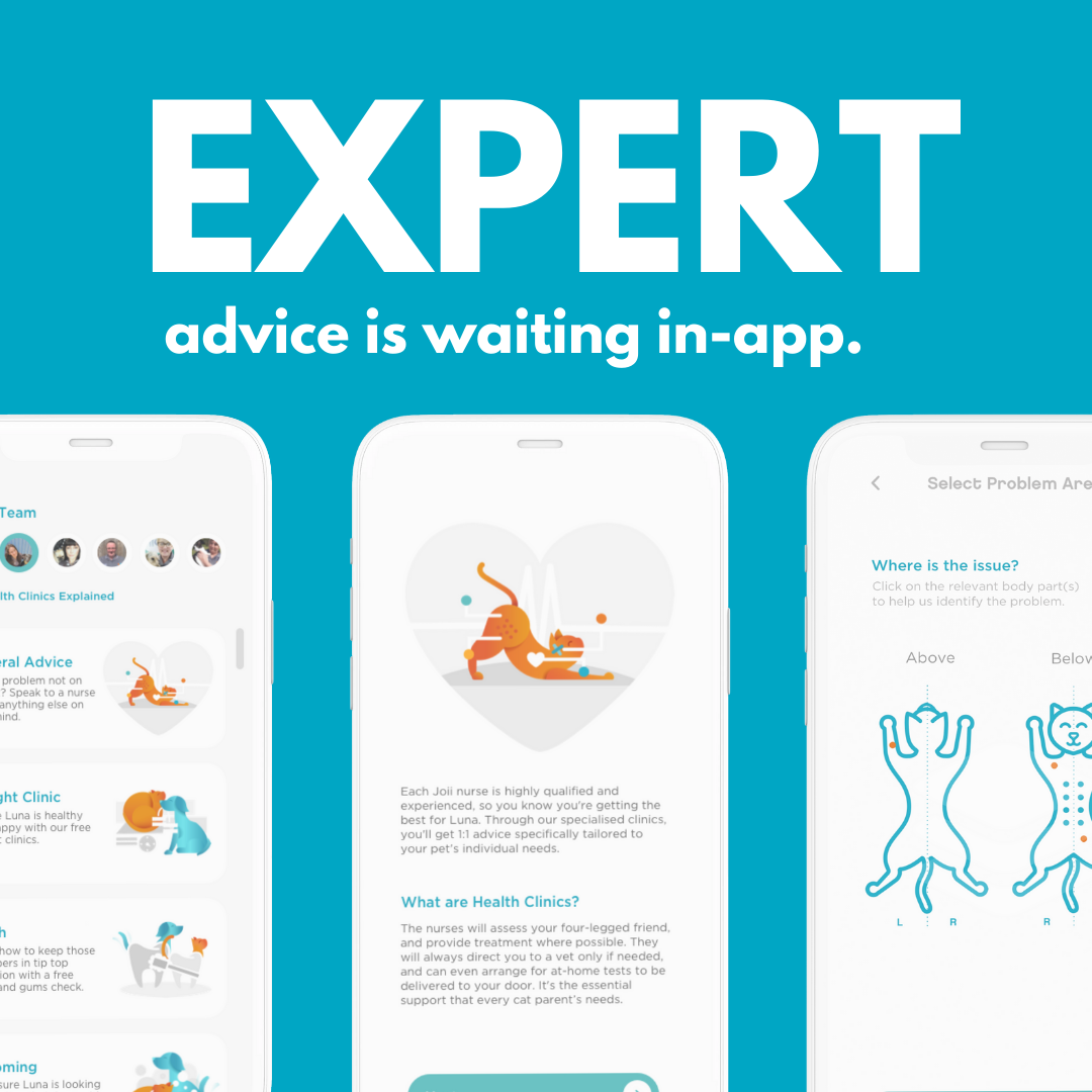
The UX illustrations for the app use blue as orange as the primary colour and focus points to represent the dog and cat and shades of grey to bring out the background and other elements so as to not distract users from the main point of interest. Other colours are used to highlight and bring attention to other smaller elements.
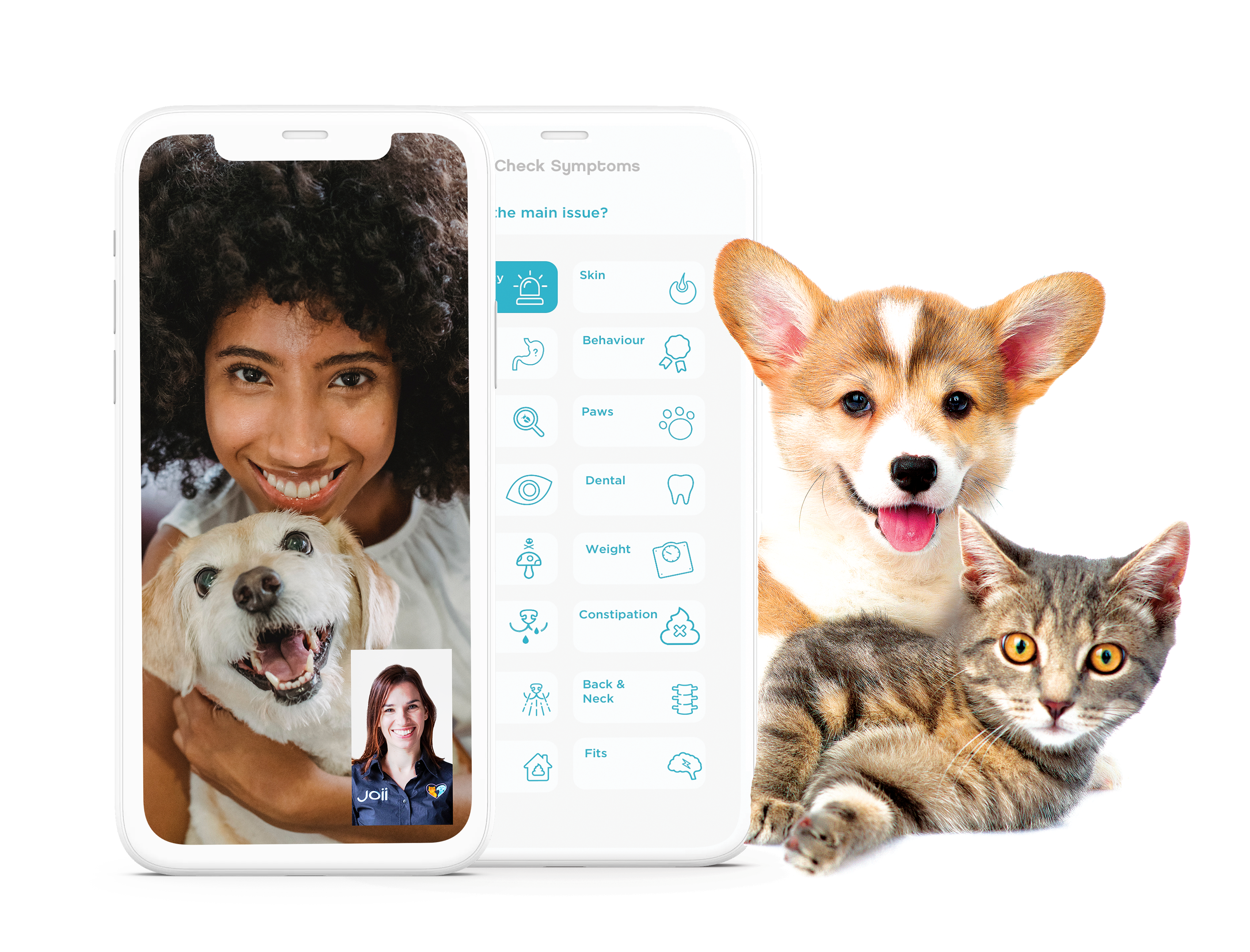
User query
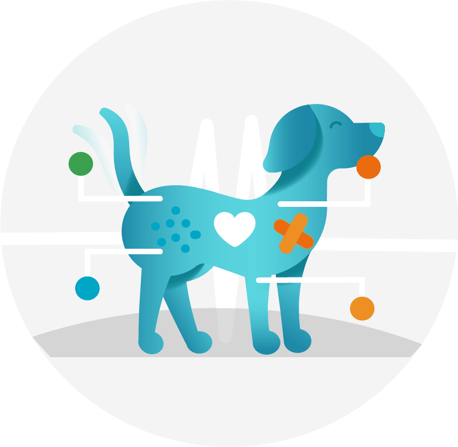
Symptom checker V1
Weight clinic
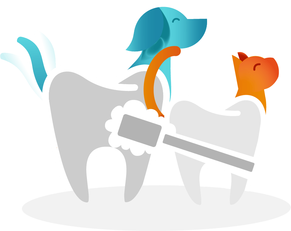
Dental
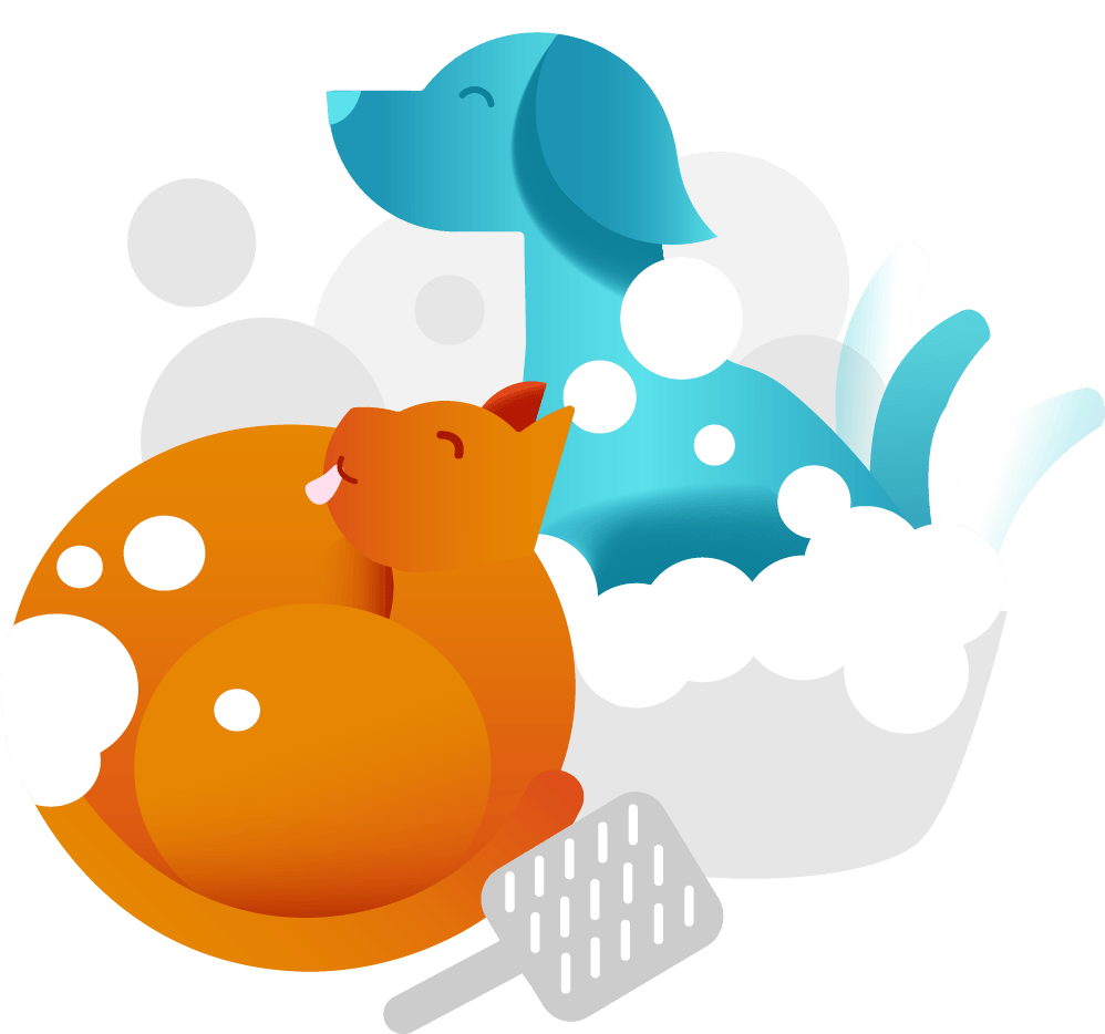
Grooming
Geriatric
Flea and worming
Diet advice
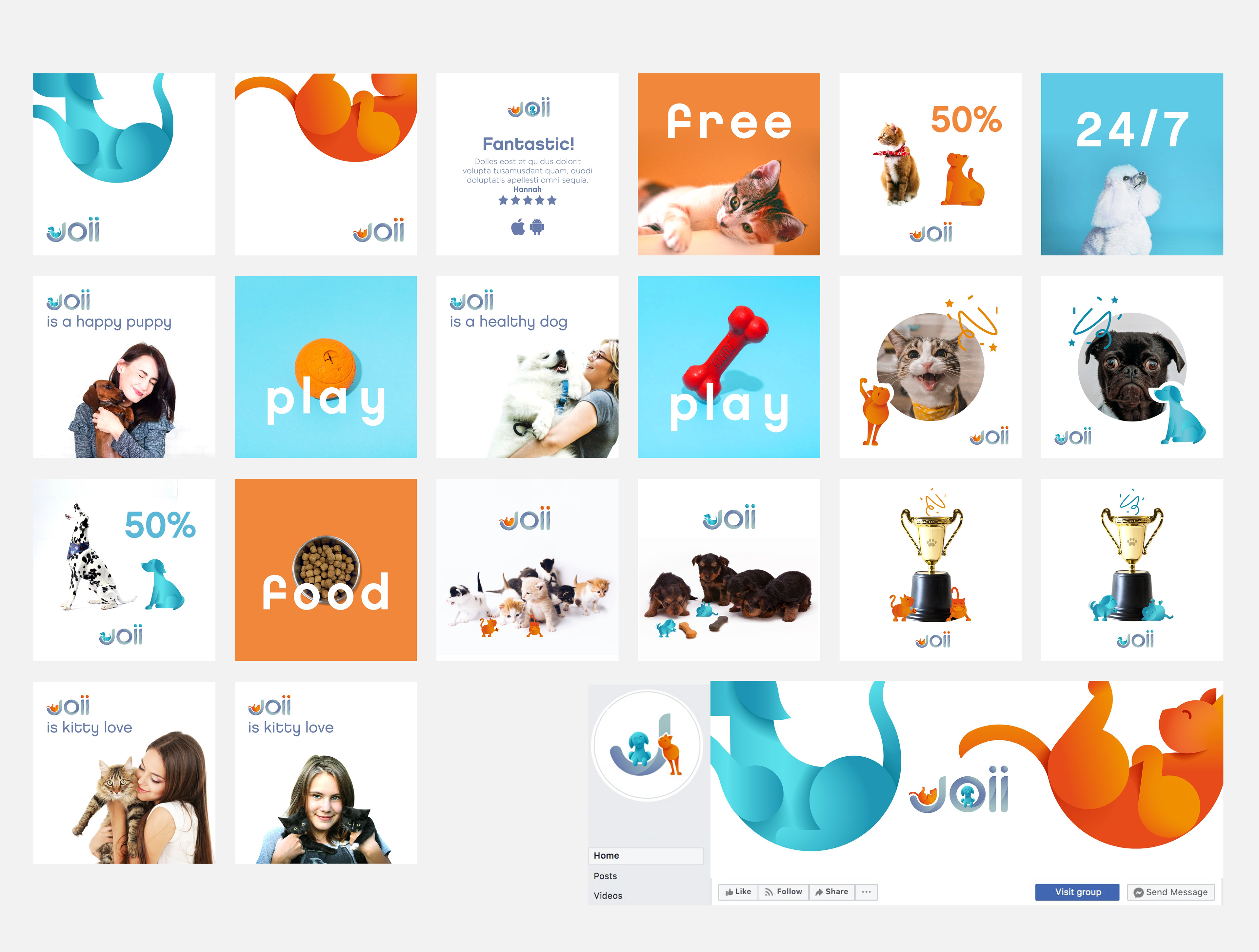
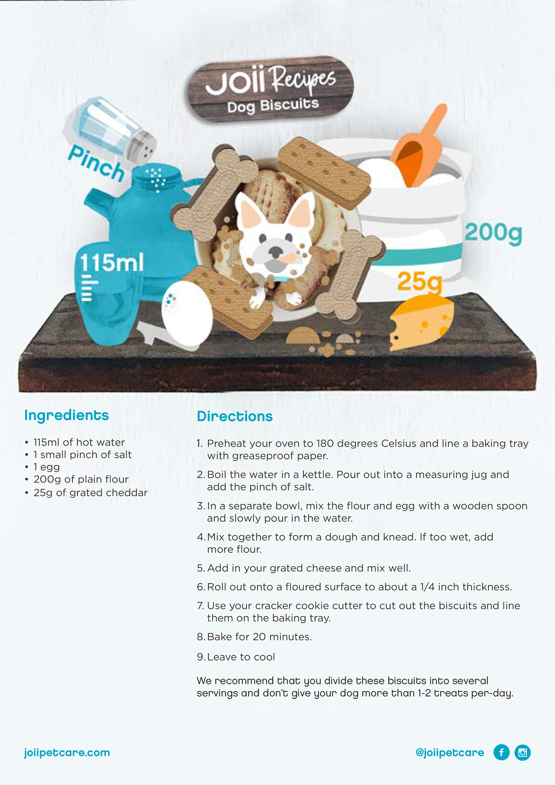
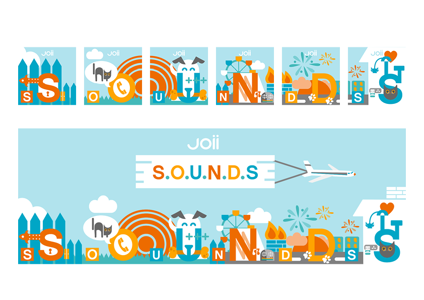
Expansive Illustration for Marketing Infographics
Making use of the entire primary colour palette to give scale to the brand and allow for visually engaging creative content to be designed for the Marketing team.
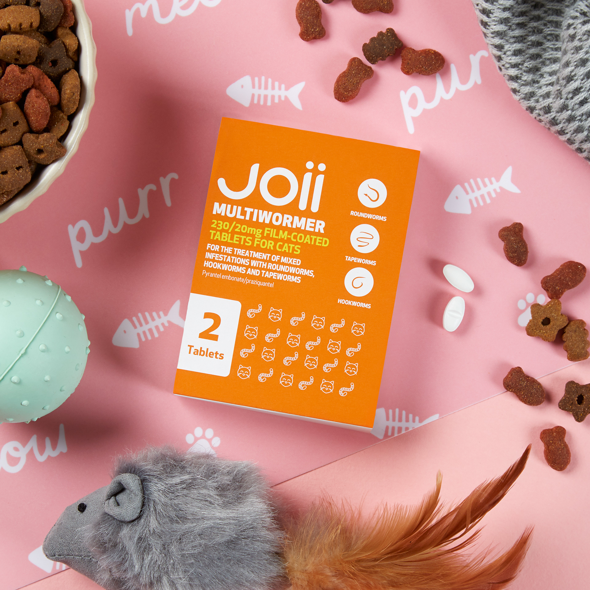
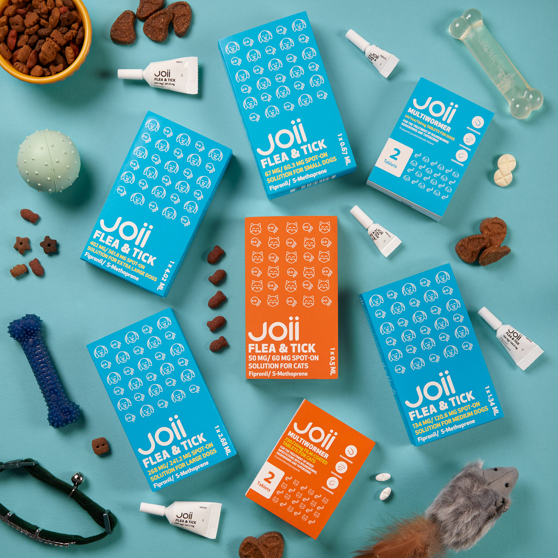
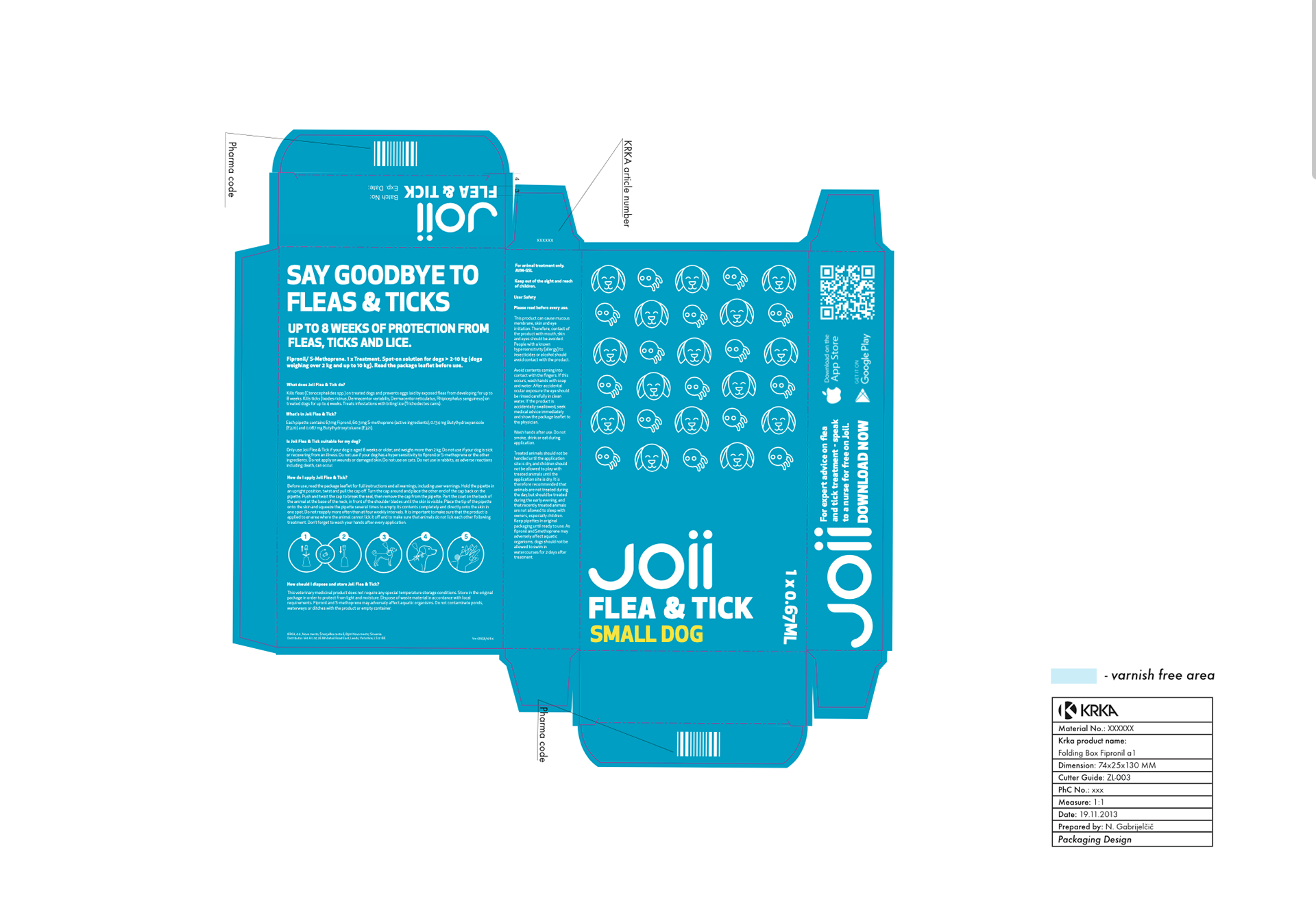
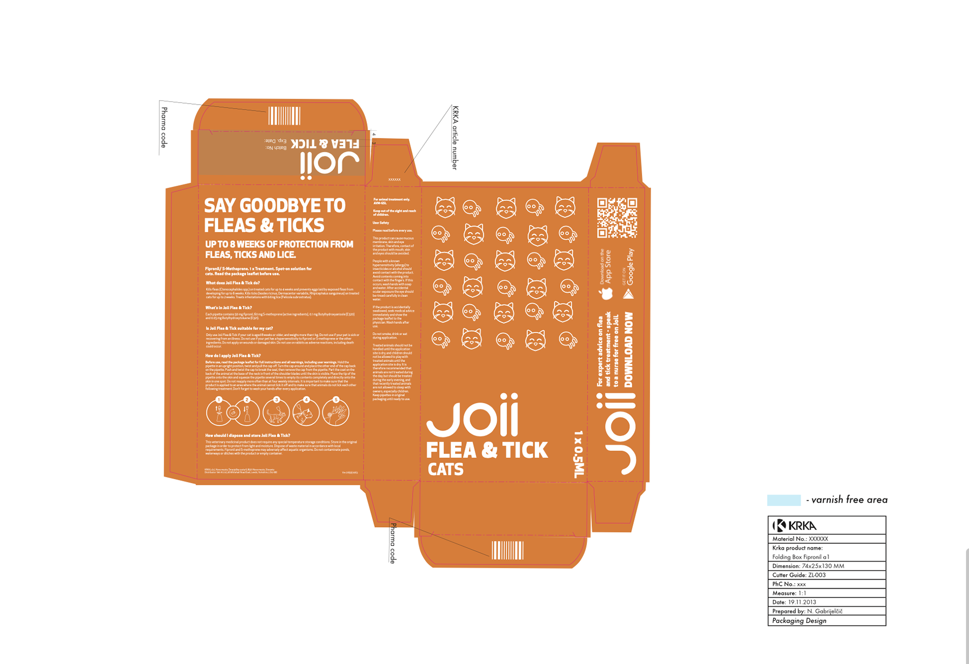
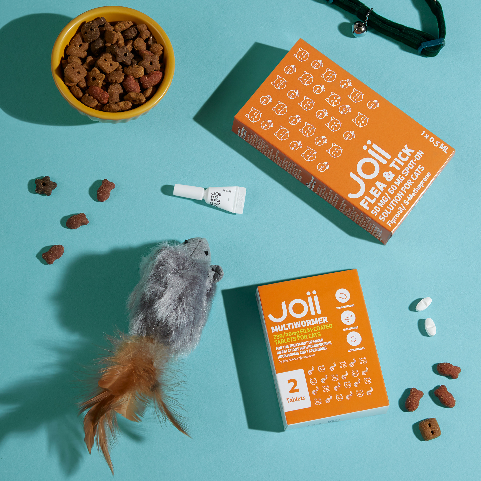
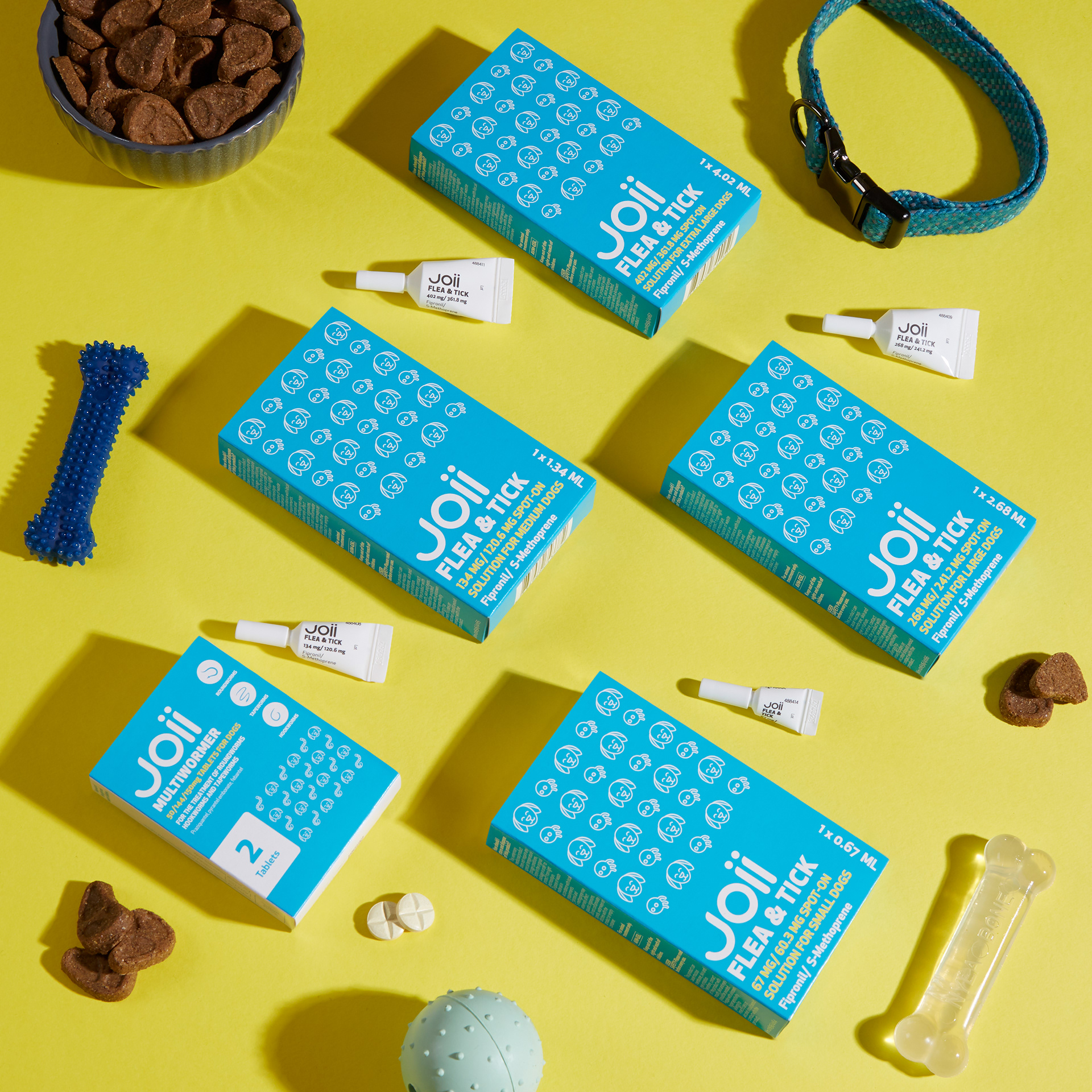
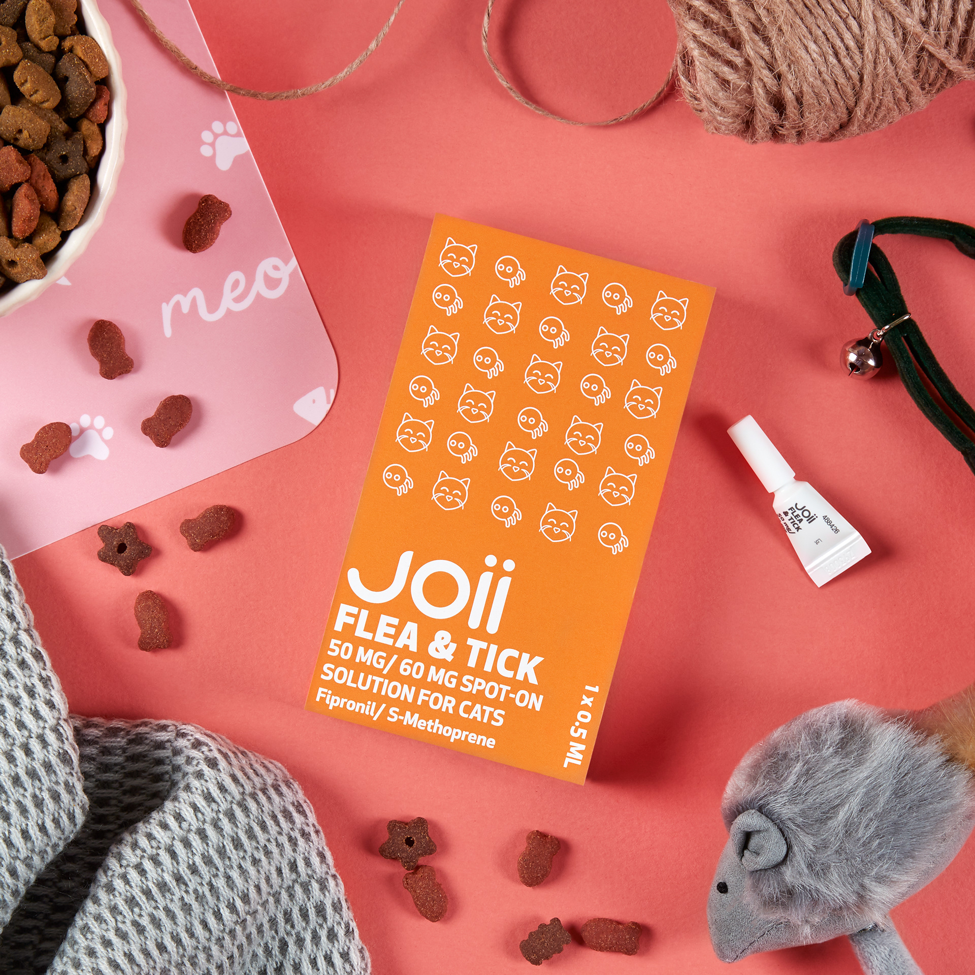
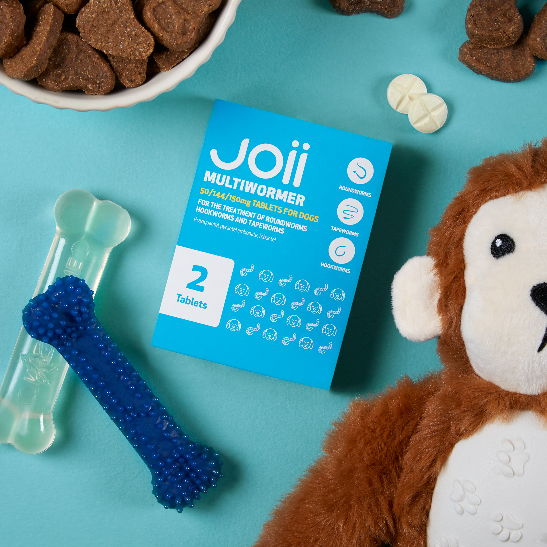
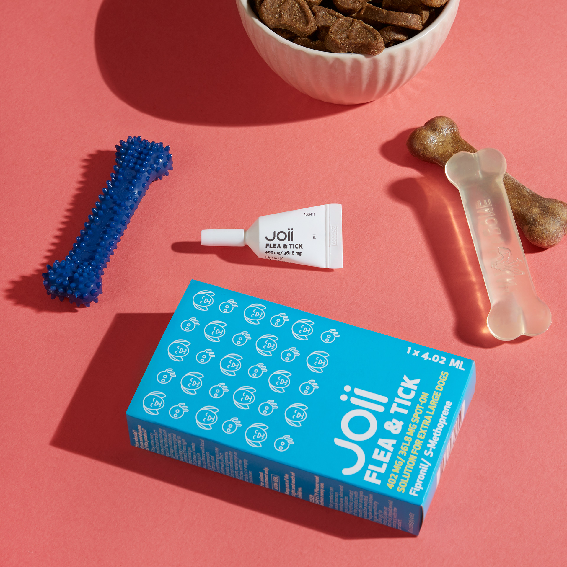
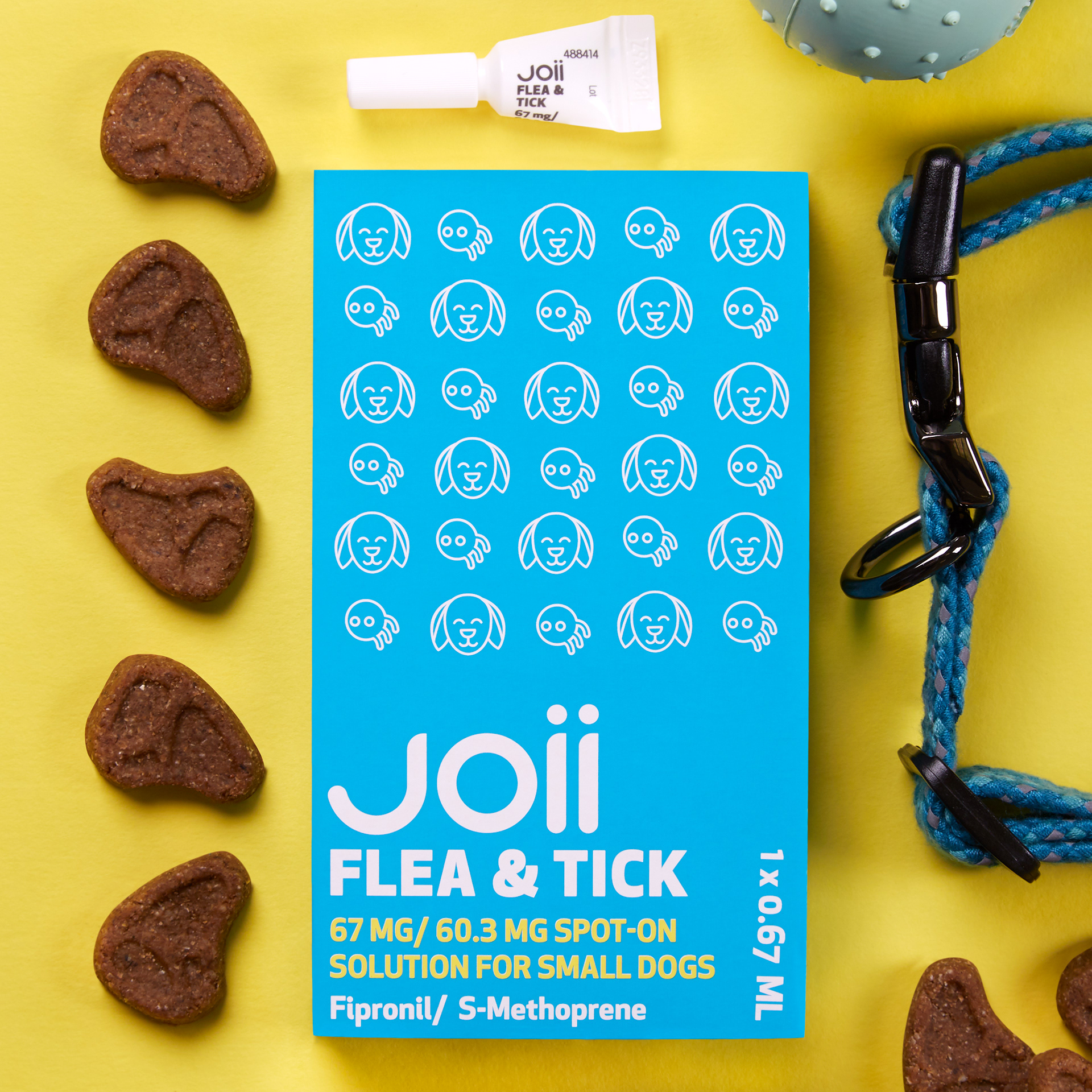
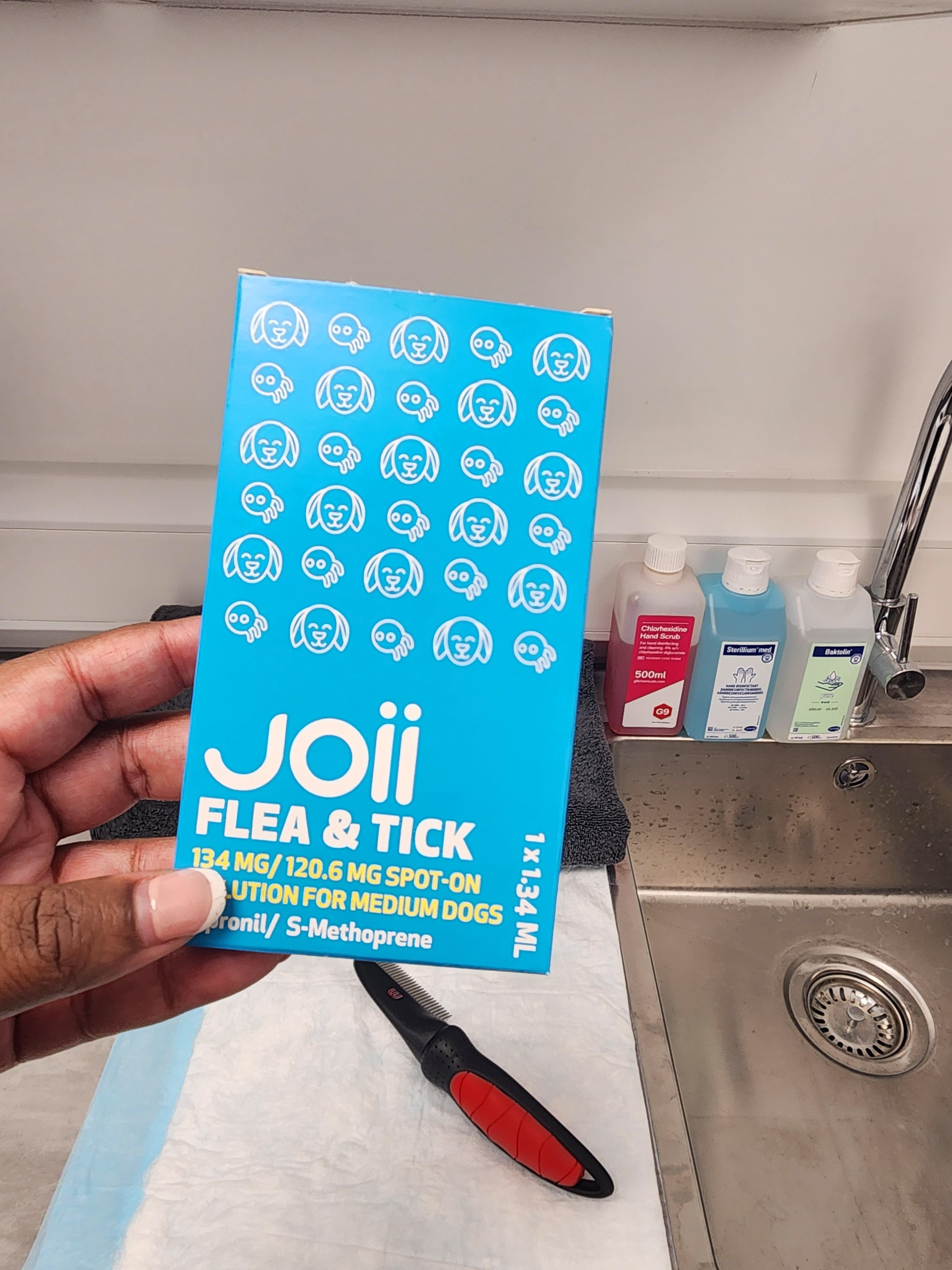
Joii Flea & Tick Packaging for Cat & Dog
Flea and tick products in the pet industry are all the same content wise because they're formulated and regulated by a company called KRKA. Because of this the only unique aspect of a F&T product is its price and packaging. Therefore it was important for us that the packaging for Joii's flea and tick be as distinct as possible. We are also the first to introduce different colours for cat and dog, in line with Joii's own branding.
It was also important that as the Joii app's first physical product the app still had a presences in it's packaging so I used iconography from the app to create a distinct pattern that was relevant to flea and tick, and I also added a QR codes to the side to promote the app.